Design a football match card without promising the wrong channel
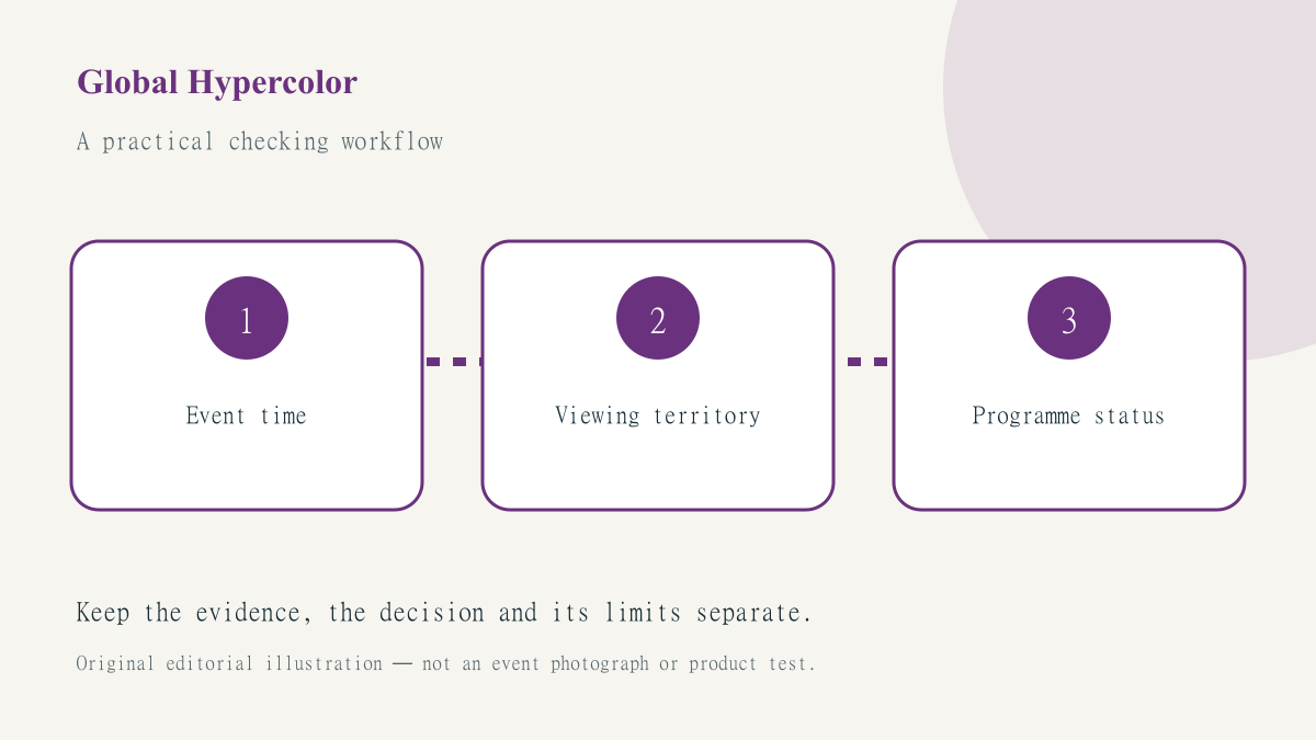
A match card can be beautifully arranged and still give the wrong instruction. A channel name without a territory, an unlabeled time or a large live badge can turn a useful design into an unsupported viewing promise. Before choosing a typeface, decide exactly what the card is meant to tell its reader: the sporting start, the start of a programme, or a venue’s confirmed screening arrangement.
The football broadcaster checking guide provides the underlying distinction between general rights and a selected programme. Here the design problem is narrower: how to preserve that distinction in a small visual object that may be copied, cropped and read without its accompanying article. No current broadcaster or fixture is being recommended in this guide.
Start with fields, not decorative labels
Create separate fields for event name, event date, event start, time zone, viewing territory, programme name and last verification time. Add a field for the source page even if the final graphic links to it through a readable short label rather than showing a long address. These fields prevent a familiar badge from standing in for an actual programme check.
For a hypothetical international fixture, the competition may publish one start instant while a broadcaster lists build-up before it. A venue may ask visitors to arrive earlier still. Those are three different times. Do not squeeze them into a single large number with a small explanation that vanishes in a thumbnail. Choose the primary action, label it accurately and retain the other times only where the reader needs them.
Make territory part of the statement
Place the territory next to the viewing information, not only in a distant page footer. A card headed UK viewing is more precise than an unqualified watch here instruction. If a separate edition is made for another country, recheck the underlying programme rather than changing a flag and keeping the same channel. A new language or colour palette does not establish new distribution rights.
When a programme has not been confirmed, use a neutral schedule card with a link to the current check. The fixtures and results page can help readers identify the event, while the sports TV guide provides a separate route for viewing research. The visual should not imply that a listed fixture is automatically available on every platform in every country.
Design the small version first
Test the essential statement at the smallest intended display size before adding secondary information. Ask someone who has not seen the brief to read the card aloud. If they confuse build-up with the match start or cannot identify the time zone, the hierarchy has failed even if every field technically appears somewhere. Use explicit labels rather than expecting readers to recognise a country’s daylight-saving rule.
Keep contrast and spacing generous, and avoid encoding live, replay and highlights only through different colours. Those labels describe materially different viewing experiences. An icon can support a text label, but should not replace it. For a screen viewed across a room, simplify the card rather than shrinking the explanatory text until it becomes decoration.
Protect dates during export and reuse
Put the full local date beside the time when midnight rollover could matter. A schedule shared across countries may refer to different calendar days even though the event has one start instant. The creative brief should include the actual intended audience and time zone; a designer should not infer them from the computer used to export the image.
Make a reusable component with locked labels and editable values, then check the complete sentence after every change. Components reduce repetitive work, but they can also repeat mistakes efficiently. A copied badge saying live is not safe merely because the new date and team names were entered correctly. Keep an evidence field in the production register so the reviewer can trace the current claim.
Give the card an expiry and a useful destination
A pre-event card should have a planned retirement or review point. After the event, it may need replacement with a clearly labelled result, an authorised highlights link or a neutral archive note. Do not keep a booking instruction active simply because the design remains attractive. Equally, do not fabricate a result in advance to prepare a complete-looking campaign.
Use SportsFixtures as a reader resource, not as a substitute for the receiving website’s own responsibility for its card. Keep the design’s destination stable, show real corrections and inspect the published image as well as the editable file. Our publication purpose is to make visual decisions understandable: a reliable card tells readers what is known, where it applies and what they should check next.